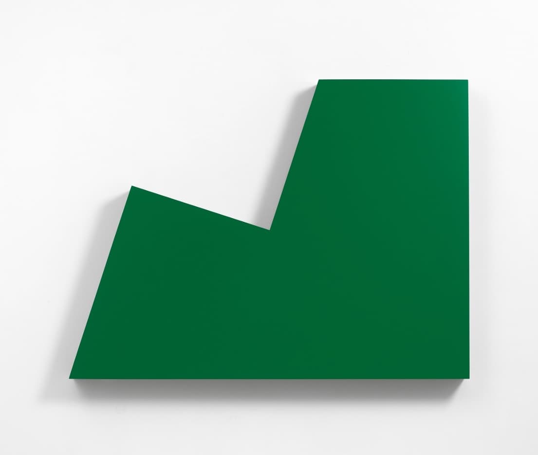
Carmen Herrera's use of color is deceptively simple on the surface and endlessly complex once you look closely. Working almost entirely in two or three hues per canvas, the Cuban-born painter spent more than seven decades proving that a single line between two colors could hold as much tension as any crowded composition. Her artist page traces a career that ran from Havana to Paris to New York, but it is her color choices, sharp, deliberate, and rarely more than three per painting, that collectors and curators keep coming back to.
Who Was Carmen Herrera?
Carmen Herrera was born in Havana in 1915 and died in New York in 2022, a few weeks shy of her 107th birthday. She trained briefly in architecture before turning fully to painting, a background that shows in the precision of her compositions.
Her international career took shape in Paris, where she lived from 1948 to 1953. There, she became associated with an international group of artists, the Salon des Réalités Nouvelles, exhibiting her work with them regularly and developing a distilled, geometric style of abstraction. She reduced her palette to three colors for each composition, a habit of self-limitation that would define the rest of her working life.
Recognition came astonishingly late. Herrera sold her first painting in 2004, at age 89, after decades of working with little commercial recognition. Yet she is now considered a major figure in geometric abstraction. Her 2016 retrospective at the Whitney Museum, Lines of Sight, finally introduced her work to a broad public, and it later traveled to the K20 museum in Düsseldorf for a run from December 2017 to April 2018.
A Radical Reduction: How Herrera Used Color
Most painters build complexity by adding. Herrera built hers by subtracting. She described the effect directly in an interview with Phillips auction house: "Color is the essence of my painting. What starts to happen to it as you reduce its numbers and come down to two colors, then there is a subtlety, an intensity in the way two colors relate to each other."
That statement is the key to reading almost any Herrera canvas. Instead of a full spectrum, she isolated a single pairing, such as green and white, black and orange, or red and black, and let the razor-sharp edge between the two shapes do all the expressive work. The result is a kind of optical pressure: the colors seem to push against each other along the seam where they meet.
Her formal ambitions were equally spare. As she put it in a 2012 statement quoted by the Royal Academy of Arts, her quest was for "the simplest of pictorial resolutions." Color, in her hands, was never decorative. It was structural, the load-bearing element of the whole composition.
The Discipline Behind the Palette
Herrera's restraint was not timidity. She had strong, stated preferences. Commentators writing about her practice noted her love of bold, daring, strong colors, most often limited to two at a time, frequently white paired with green or green paired with black. That narrowing was itself a form of authority: by refusing more than two or three hues, she forced viewers to register color relationships with unusual clarity.
She also spoke with total conviction about her formal vocabulary more broadly, once remarking about the line that shaped her compositions that she had never met a straight one she did not like. Color and line, for Herrera, were never separate problems. The color decided where the line had to fall, and the line decided how the color would be read.
Blanco y Verde: Herrera's Signature Color Pairing
No single body of work demonstrates Herrera's approach better than her Blanco y Verde (White and Green) series, which she returned to again and again between 1959 and 1971. Only 14 known versions exist, and the series is widely considered a high point of her career.
The Smithsonian American Art Museum, which holds one version in its collection, describes how Herrera's paintings conjure spatial tension and movement through crisp geometry and bold color, with Blanco y Verde created using only two colors, green and white, and sharp triangular forms.
What makes the series remarkable is how much variation Herrera extracted from just two colors and a repeated geometric vocabulary. Dana Miller, who curated the Whitney's 2016 retrospective, explained in the museum's own exhibition guidethat, for Herrera, this was a particular color combination and arrangement of shapes that fascinated her. Miller described the pairing of green and white as being like saying yes and no. That paradox, a single pairing standing in for total opposition, is what gives the series its lasting charge.
Herrera herself considered it the summit of her output: she said this series was the most significant of her career.
Beyond Green and White: Other Key Palettes
While Blanco y Verde is Herrera's best-known pairing, she worked through other combinations with equal rigor over the decades. Orange and black appear in some of her most sought-after paintings from the 1950s, a pairing that reads as warmer and more aggressive than the cool logic of green and white. Red, black, and yellow surface in other compositions, always in small, controlled doses rather than full palettes.
Her willingness to connect specific color combinations to specific moods or ideas, rather than choosing them arbitrarily, is part of what art historians point to when discussing her intuitive side. Analysis from The Art Story notes that, across different series, Herrera connected different color combinations and shapes with different days, suggesting that despite the clean and clinical abstraction of her work, she had a strongly intuitive feel for shape and color. In other words, the geometry may look mathematical, but the color choices behind it were personal and felt.
Why Herrera's Color Sense Commands the Market
Herrera's reduction of color to its essentials has translated directly into strong demand among collectors, particularly since her market really caught fire following the 2016 Whitney show. Phillips set an auction record for the artist when her 1956 painting Untitled (Orange and Black) sold for $1,179,000 in a November 2017 evening sale, a price that reflected renewed appreciation for her tightly controlled early palette.
That record did not hold for long. A version of Blanco y Verde from 1966-67 sold for $2.9 million at a Sotheby's benefit auction in 2018, a result widely reported as a new high for the artist. The sale, held to benefit Miss Porter's School, underscored how thoroughly the market had come to associate Herrera's name with that specific green-and-white pairing.
For collectors researching available paintings and prints today, LatinAmericanArt.com's artworks section and galleries directory are useful starting points, alongside her estate's primary representation at Lisson Gallery.
Seeing Carmen Herrera's Color in Person Today
Major museum collections now hold examples of Herrera's color-driven abstraction, including the Whitney Museum, the Smithsonian American Art Museum, and institutions in Europe that hosted the traveling version of her retrospective. Visiting in person remains the best way to understand her work, since reproductions rarely capture how a hard, flat edge between two colors can seem to vibrate on the wall.
Readers tracking upcoming shows can check LatinAmericanArt.com's events listings for gallery and museum presentations, and browse editorial coverage of other 20th-century Latin American abstractionists whose color strategies invite comparison with Herrera's, including her Cuban, Venezuelan, and Brazilian contemporaries in the Concrete and geometric abstraction movements.
FAQ
What colors did Carmen Herrera use most often? She favored tightly limited palettes of two or three colors per painting, most famously green and white in her Blanco y Verde series, but also black paired with orange or red.
Why did Carmen Herrera limit her palette so strictly? She found that reducing the number of colors increased the visual tension and subtlety between them. As she explained, coming down to just two colors created "an intensity in the way two colors relate to each other."
What is the Blanco y Verde series? It is a body of work Herrera returned to between 1959 and 1971, using only green and white with sharp triangular forms. Only 14 known versions exist, and she considered it the most significant series of her career.
Where can I see Carmen Herrera's paintings today? Her work is held by major institutions, including the Whitney Museum and the Smithsonian American Art Museum, and it continues to appear in gallery shows and museum retrospectives worldwide.
How much do Carmen Herrera paintings sell for? Prices have risen sharply since her 2016 Whitney retrospective. Auction records include a 1956 orange-and-black painting that sold for more than $1.1 million and a Blanco y Verdecanvas that reached $2.9 million in 2018.